Designing an interactive interface to display Water Quality Information
Design an immersive display that informs students about not just water quality, but also important information related to water such as local and global news, how consuming bad quality water can affect their health, and a bunch of facts about water.
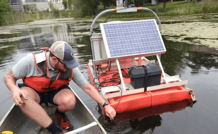
“Ada” and “Alan” are our university’s deployment for real-time water monitoring stations in Choate Pond in the Pace University campus in Pleasantville, NY.
Every fifteen minutes, they collect water quality measurements from the pond, send that data to the server where a Blue CoLab program automatically calculates a Water Quality Index.
“You have a right-to-know what is in your water before you use it or drink it, just as you have a right-to-know the ingredients in a bag of potato chips.”
While designing we not only need to address the literacy level but also the level of exposure to technology, motivation and user experience.
CONTEXT
GENERATIVE RESEARCH
CHALLENGE
MY ROLE
Research
Conceptualisation
UI design
Usability studies
THE TEAM
Worked on this academic project with 1 other student.
TIMELINE
Sept 2022 - Dec 2022
Literature
Review
Insights:
the deployment
~

RESEARCH
SOME MORE RESEARCH
DESIGN ITERATIONS & USABILITY TESTING
FINAL SOLUTION
INTERACTIVE PROTOTYPE
Issues Found:
FIELD STUDY
to help us focus on generating ideas and concepts for our design while prioritizing our user needs.
29 response recorded.
46.4% of the participants were clueless about WQI.
41% checked the quality of water before consuming it.
60% were interested in knowing more about their water, water in general and were willing to interact with a kiosk that informs them of the same
Conducted semi-structured interviews.
5 participants, I interviewed 3 of them.
The interviews were recorded with consent, and the quotes obtained from them were organized using affinity mapping for analysis.
They also mentioned the need for having an information display near every water dispenser to make people curious about what they are consuming and what is happening around them.
We also visited a food chain where customers can order food items using the kiosk installed by the store. We observed and noted down their experience.
We found that the ignorance regarding water quality is not because of the people’s disinterest, but caused by the lack of
information and knowledge provided to them.
Participants: students residing in the NYC or Jersey City area.
The usability testing was conducted on the first iteration of the design.
We asked the users to complete 4 tasks:
1) Search for real time Water Quality Information.
2) Check out water related facts.
3) Find and explore kiosk locations on campus.
4) Look at global news related to water pollution.
Field study took place on the second iteration. The purpose of this study is again for users to perform the predefined task while thinking aloud for us to know their experience, understanding and navigation of the water information on kiosk. Few questions were also asked after the task completion for feedback and suggestions.
We conducted this study with 9 users for 5 days to see how familiar they grow with design and its features with time.
We also deployed a SUS questionnaire to measure the usability every time they performed tasks.
Participants: students studying in Pace University and/or residing in the NYC and Jersey City area.
Tasks to perform:
Look for real-time water quality information
Look at global news related to water pollution
Learn how consuming bad-quality water affects your health.
Questions asked after task completion:
What are/were your first few thoughts after going through the design?
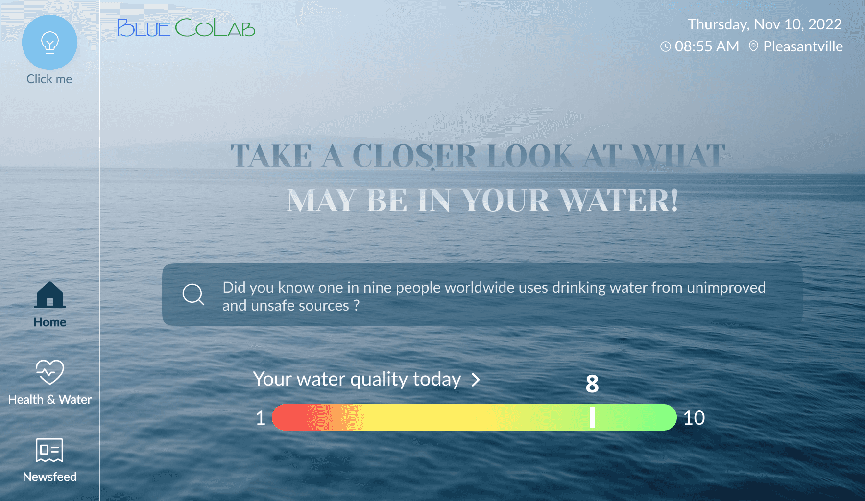
What do you think about the information provided inside the water quality index scale (WQI)?
What do you think about the “Click Me” feature?
Did you find the design to be visually appealing?
Future
Improvements
Future Impact
Positives
Online Surveys
User Interviews
Observation
BEFORE
AFTER
Competitive
Analysis
Insights:
Insights:
Insights:
What did we learn?
In order to study the domain of real-time water quality information displays, we did:
In order to study the domain of real-time water quality information displays, we did:
This left us with the question of how we can make the product usable for the public that is easy to understand and will also educate the users on water quality information instead of just providing them with scientific results.
From these studies, we created research questions categorized into the following three main categories. Afterward, we designed a questionnaire for interviews and surveys based on these categories.
1. Water Quality Awareness
2. Generating curiosity among students about water
3. Interaction Habits with interactive displays
Given our knowledge of the target audience as university students and our decision to place it near all the bottle filling stations, we decided to design an interactive kiosk.
And, that’s how we came up with the challenge statement!
How can we make the product usable for the public that is easy to understand and will also educate the users on the water quality information instead of just providing them with the scientific results.
Existing applications are too technical and can’t be used by the regular public.
It uses scientific terms that might not be familiar to most people, and there's no clear explanation of what these terms mean.
So, how did we decide on the challenge statement?

We initially thought this “map feature” would work well because we expected multiple kiosks on campus. However, after considering the placement near every water dispensers, we and the users realized it was not needed anymore.
Our attempt to highlight the “facts” icon led to user confusion. They were unsure which tab was currently active, whether it was the home icon or the idea icon.
To capture users' attention, we added an effect where the color of the icon changes every few seconds, added text for clarity, and we also adjusted its placement to minimize confusion.
We included a playful reminder pop-up design for a fun touch, but users perceived it as a notification that required dismissal.
To eliminate confusion caused by the previous design, we changed the design.
The icon's visibility when selected is not seen immediately. The users were confused as to which page they were on, as the icons did not do a great job in indicating that.
Changed its design from border to fill when selected.
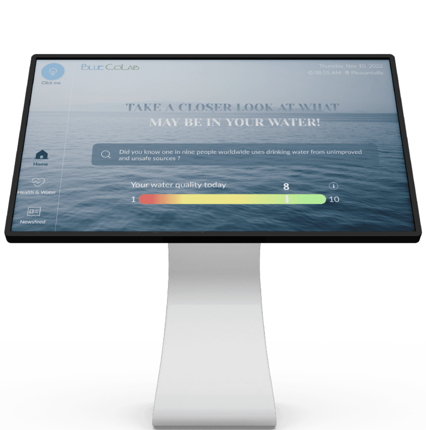
We also observed customers in wheelchairs facing challenges with vertical kiosks. Upon seeing that we decided to design a horizontal kiosk to ensure accessibility for everyone. Additionally, the stand on which it will be placed will be adjustable to accommodate users' needs.
Elaborating how the WQI is calculated and to measure a certain components affects the overall quality of water.
The immersive display can serve as a educational tool, raising awareness about the importance of water quality and the broader implications of water-related issues.
This knowledge can empower them to make informed decisions about their water consumption.
Majority of the users found the kiosk design to be very easy to use and understand.
The users felt like they needed more information in the section of Ph, salinity, turbidity., etc for users to understand how a certain component might affect their health.
The users liked the simple and straightforward navigation.
The color of the text can be experimented with.
The users liked the animations of how each item in the card is playing and found it pretty interesting to know about these facts.
The Water Quality Information bar grabbed users attention and made them explore.
Thanks for reading!
I'm open to new opportunities and would love to hear from you.